DA-100 PL-300 Topics
You have a table that contains sales data and approximately 1,000 rows. You need to identify outliers in the table. Which type of visualization should you use?
A. donut chart
B. pie chart
C. area chart
D. scatter plot
Correct Answer: D
Outliers are those data points that lie outside the overall pattern of distribution & the easiest way to detect outliers is though graphs. Box plots, Scatter plots can help detect them easily.
Reference:
https://towardsdatascience.com/this-article-is-about-identifying-outliers-through-funnel-plots-using-the-microsoft-power-bi-d7ad16ac9ccc
You need to create a visual as shown in the following exhibit. The indicator color for Total Sales will be based on % Growth to Last Year. The solution must use the existing calculations only. How should you configure the visual? To answer, select the appropriate
In the Background color or Font color dialog box, select Field value from the Format by drop-down
Box 2: Field value - With conditional formatting for tables in Power BI Desktop, you can specify customized cell colors, including color gradients, based on field values.
Reference:
https://docs.microsoft.com/en-us/power-bi/create-reports/desktop-conditional-table-formatting
Note: This question is part of a series of questions that present the same scenario. Each question in the series contains a unique solution that might meet the stated goals. Some question sets might have more than one correct solution, while others might not have a correct solution. After you answer a question in this scenario, you will NOT be able to return to it. As a result, these questions will not appear in the review screen. You have a clustered bar chart that contains a measure named Salary as the value and a field named Employee as the axis. Salary is present in the data as numerical amount representing US dollars. You need to create a reference line to show which employees are above the median salary.
Solution: You create a constant line and set the value to .
5. Does this meet the goal?
A. Yes
B. No
Correct Answer: B
Instead create a percentile line by using the Salary measure and set the percentile to 50%. Note: The 50th percentile is also known as the median or middle value where 50 percent of observations fall below.
Reference: https://dash-intel.com/powerbi/statistical_functions_percentile.php
You need to create a visualization that compares revenue and cost over time. Which type of visualization should you use?
A. stacked area chart
B. donut chart
C. line chart
D. waterfall chart
Correct Answer: C
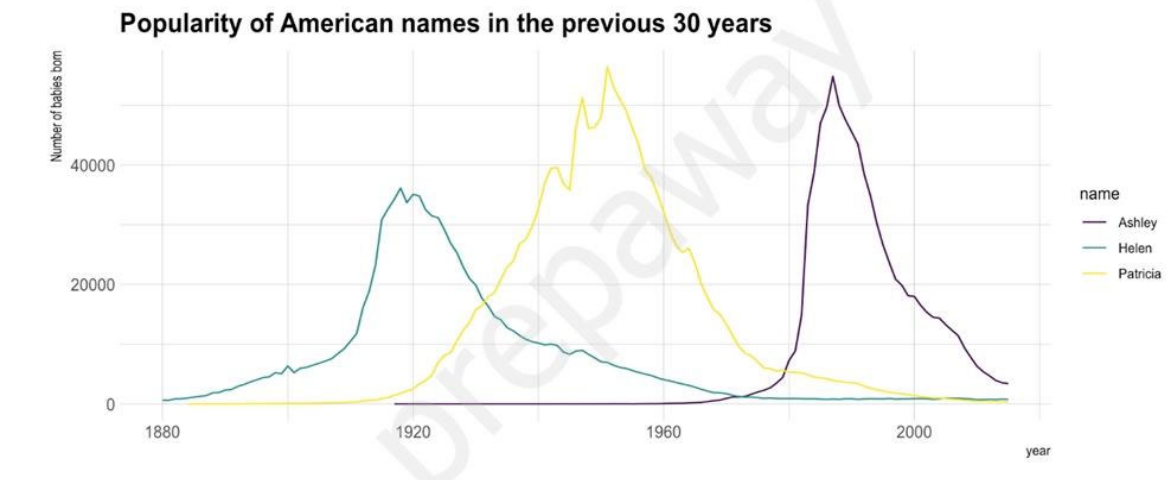
A line chart or line graph displays the evolution of one or several numeric variables. Data points are connected by straight line segments. A line chart is often used to visualize a trend in data over intervals of time ג "€a time series ג "€thus the line is often drawn chronologically. Example:
Incorrect Answers:
A: Stacked area charts are not appropriate to study the evolution of each individual group: it is very hard to substract the height of other groups at each time point.
Note: A stacked area chart is the extension of a basic area chart. It displays the evolution of the value of several groups on the same graphic. The values of each group are displayed on top of each other, what allows to check on the same figure the evolution of both the total of a numeric variable, and the importance of each group.
Reference: https://www.data-to-viz.com/graph/line.html
You have a collection of reports for the HR department of your company. You need to create a visualization for the HR department that shows a historic employee counts and predicts trends during the next six months. Which type of visualization should you use?
A. key influencers
B. ribbon chart
C. line chart
D. scatter chart
Correct Answer:
C The best data for forecasting is time series data or uniformly increasing whole numbers. The line chart has to have only one line. Try forecasting: Try the new forecasting capabilities of Power View today on your own data or with the sample report available as part of the Power BI report samples. To view your own data, upload a workbook with a Power View time series line chart to Power BI for Office 365.
Reference:
https://powerbi.microsoft.com/en-us/blog/introducing-new-forecasting-capabilities-in-power-view-for-office-365
https://learn.microsoft.com/en-us/power-bi/visuals/power-bi-visualization-slicers?tabs=powerbi-desktop


Comments
Post a Comment